What was the project about?
The goal was to design a new website optimized for search engines and mobile devices. SupportBench wanted a site that enabled their marketing team to communicate, maintain, track, and update.
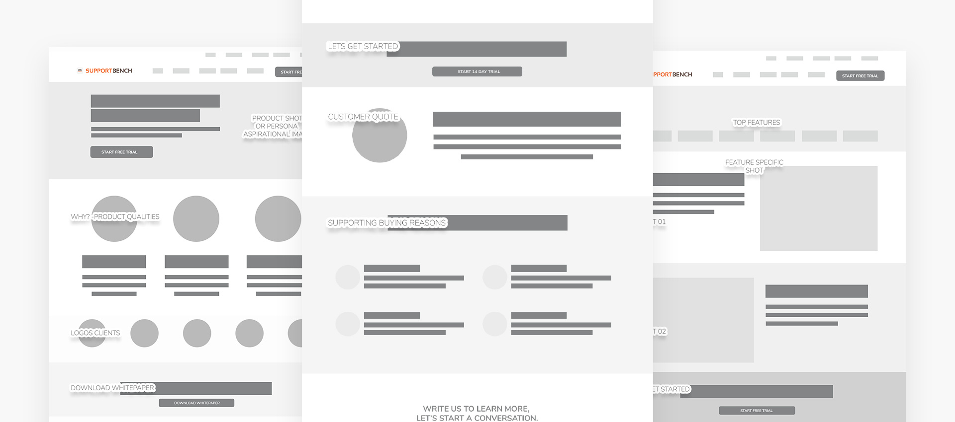
I began designing a sitemap with the goal of providing simpler navigation that made more sense to users. I analyzed their previous site structure and researched competitors to identify areas for improvement in the new website. After a few iterations of reorganizing categories, we agreed on a structure and began designing wireframes.
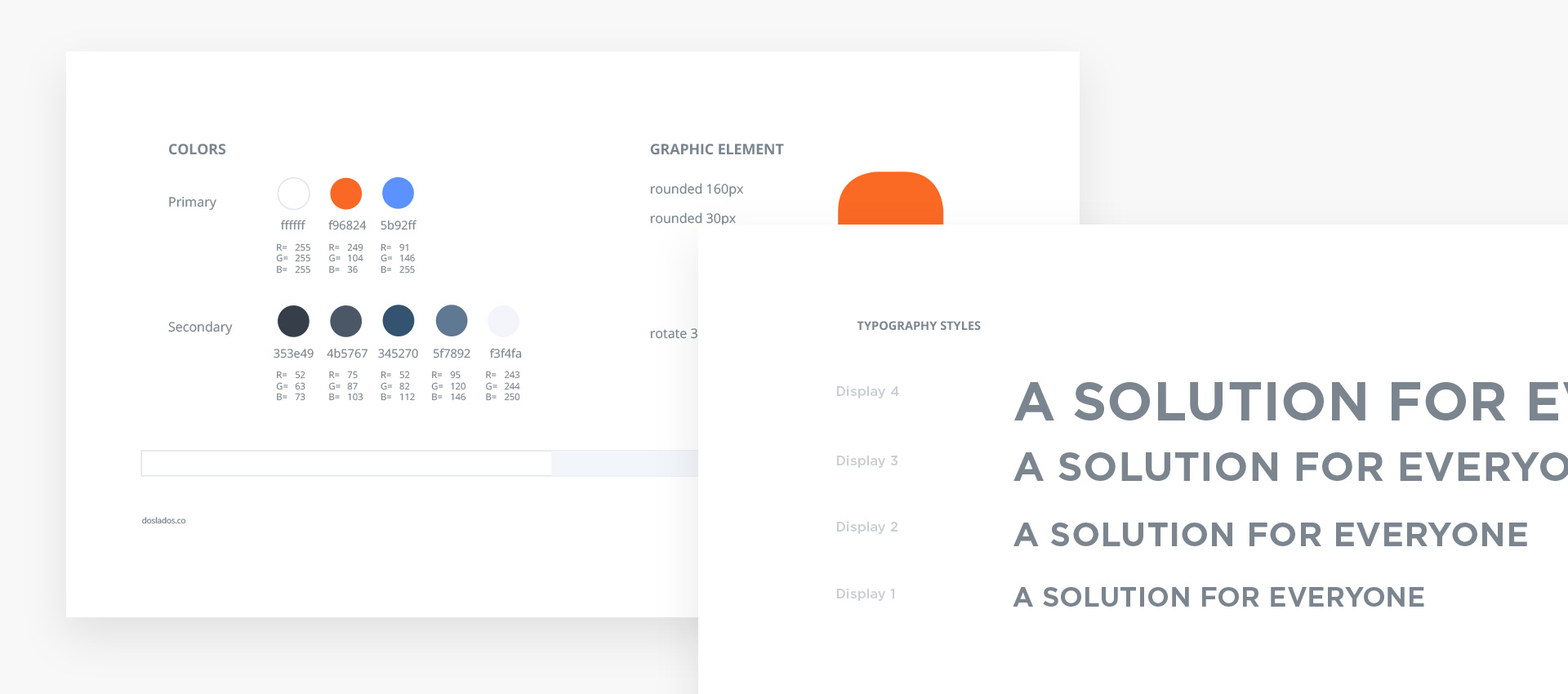
Rebrand document
I created a brand document to solidify the new brand. The aim was to achieve a brand that reflected the product’s capabilities, tone, and experience. The purpose of this document was to establish some brand rules to guide us during the project and to use these as a guide at every step. In plain words, to prevent derailing the design in the process. In this document, I defined typography, iconography, illustration, colors, backgrounds, buttons, states, layouts, etc.
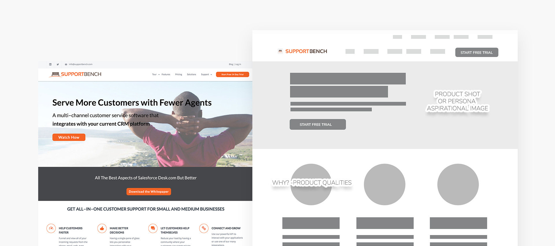
Sitemap & Wireframes
I began designing a sitemap with the goal of providing simpler navigation that made more sense to users. I analyzed their previous site structure and researched competitors to identify areas for improvement in the new website. After a few iterations of reorganizing categories, we agreed on a structure and began designing wireframes.
Then, in the wireframes, we started to provide an order for each page, focusing on having a layout that ensured a natural reading flow to communicate their services and unique selling proposition (USP). The idea here was to ensure we promoted internal navigation by maintaining the story flow, without creating dead ends. At this stage, we made sure we had positioned proper calls to action to support the business needs. The wireframes were presented to the client, and I used the feedback to come up with a new round of solutions.
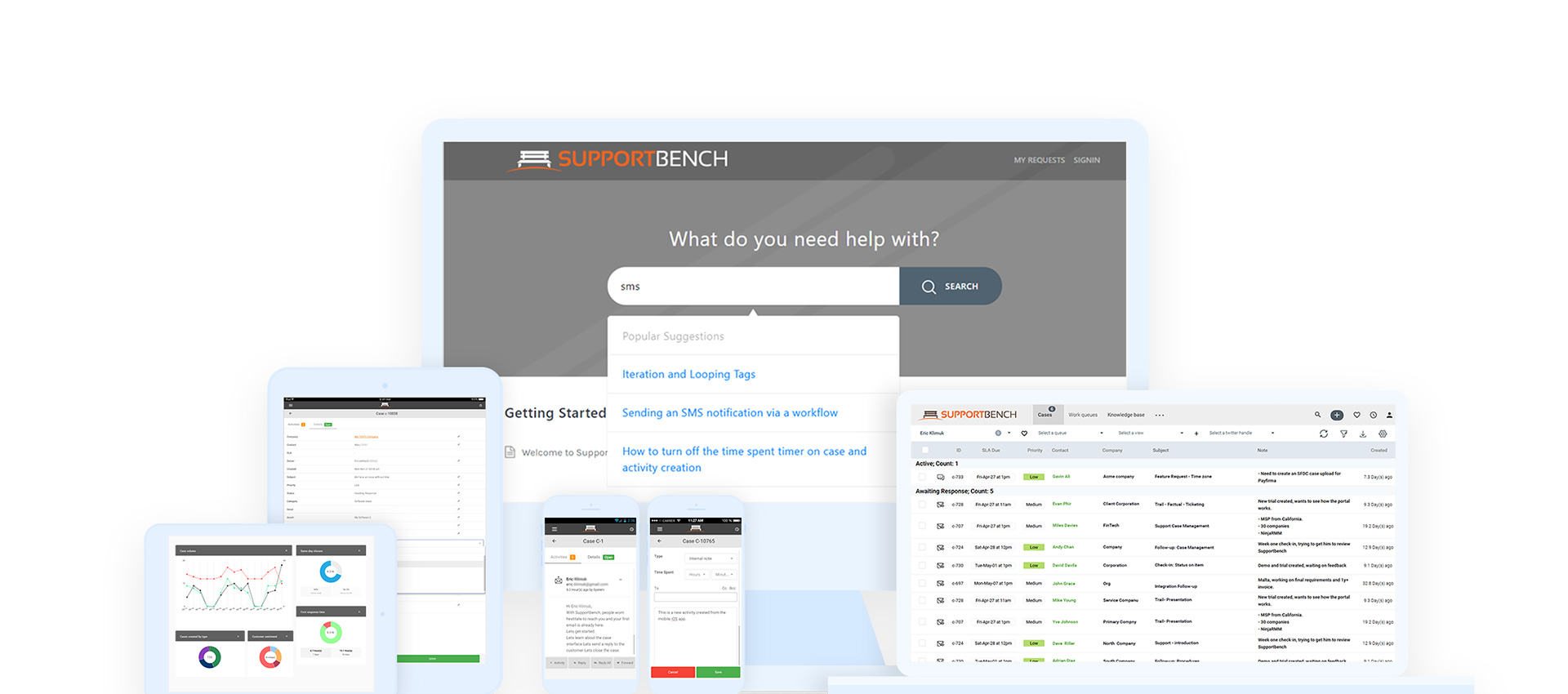
Mockups
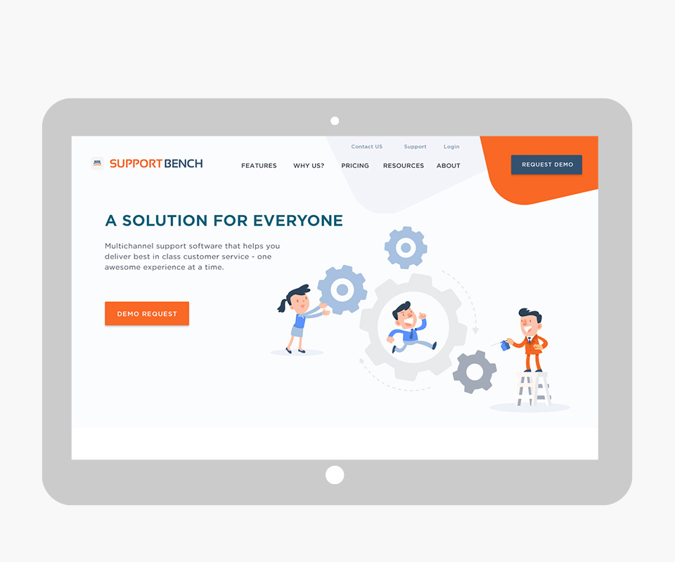
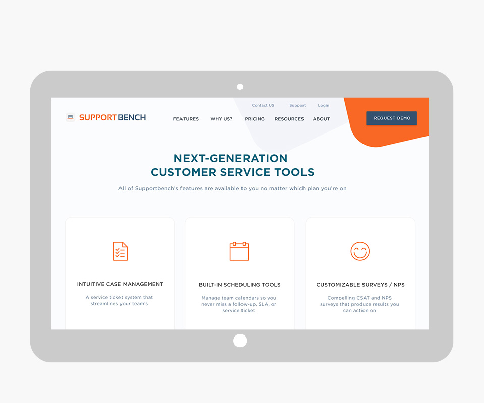
I created mockups for all pages using Adobe Photoshop. The goal here was to refine the brand experience and create pixel-perfect mockups to advance the project to development. Here, I paid special attention to ensuring that calls to action, icons, and typography were clear and had a nice contrast. Also, I aimed to provide a proper hierarchy of elements while ensuring readability and promoting empathy in users by using illustrations and bright colors in combination with engaging paragraphs.
Custom Illustration & Collateral Pieces Redesign
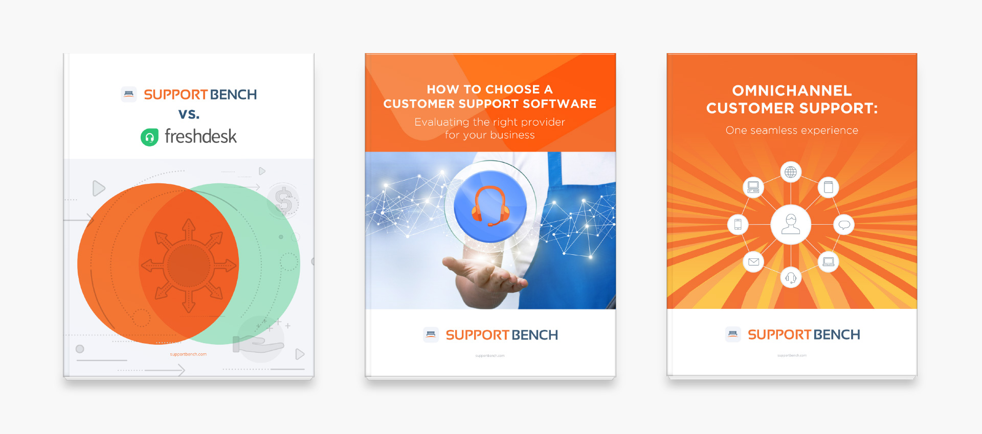
As we had a new brand, most of the supporting documentation had to be redesigned as well. I tackled all their white papers and case studies, so these would align with the new face of SupportBench.
I used some stock assets and custom illustrations for the brand that supported the storytelling in every piece. I customized each blog post image to promote these brand materials on social media. Product shots were also redesigned to match the new brand and were revamped to look great on high-density screens.