What was the project about?
For this project, I researched a group of competitors’ websites to design a booking engine that suited all business needs for BungoBox. The previous booking engine was built on a very colorful website, and the amount of color generated some difficulties for the users in finding buttons or calls-to-action. Therefore, I had to bring some focus by decluttering the experience from every aspect.
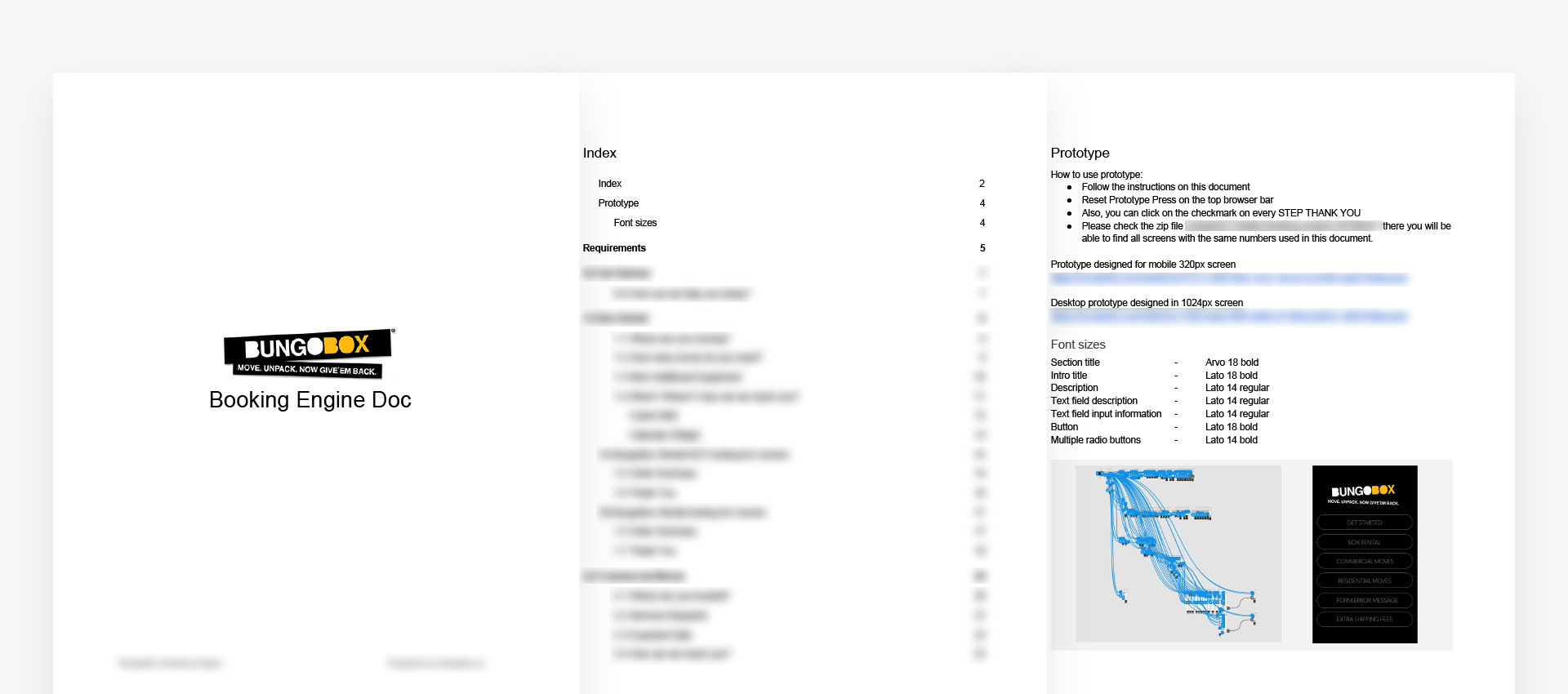
Prototype
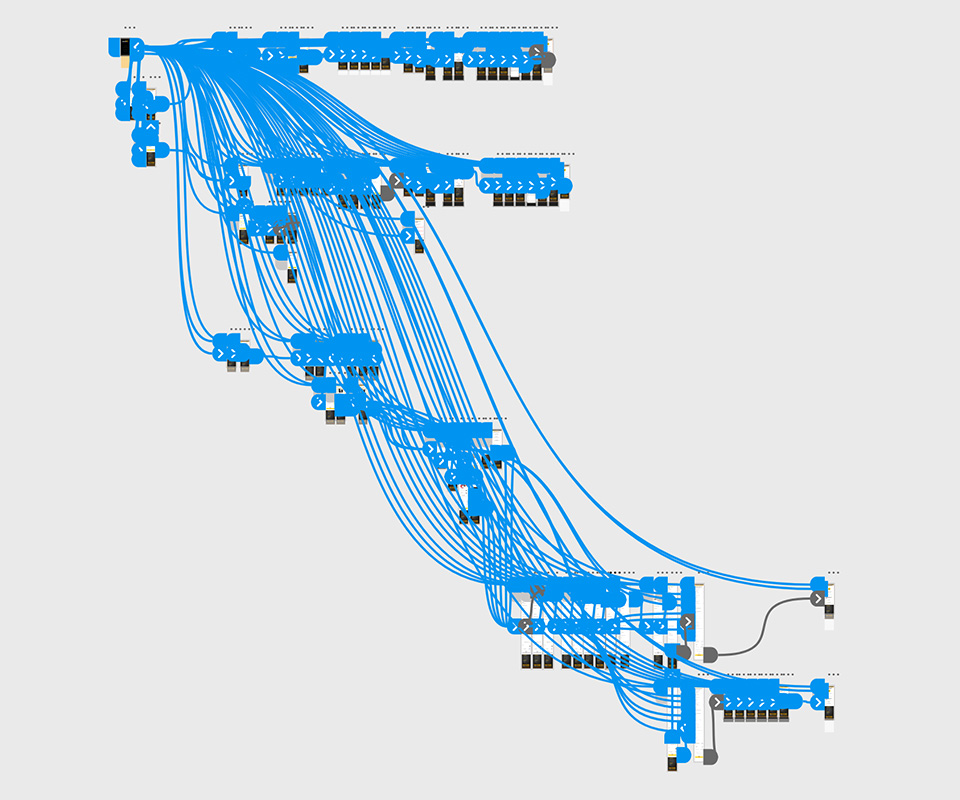
After researching, I started working on a mobile prototype based on a 320px screen to plan for the worst-size screen. I had to make this functional on a small phone, and why this? BungoBox wanted to ensure that whoever visits bungobox.ca could request services. Besides the mobile prototype, I also created a desktop version based on a 1024px screen size to have a very specific plan for the development team.
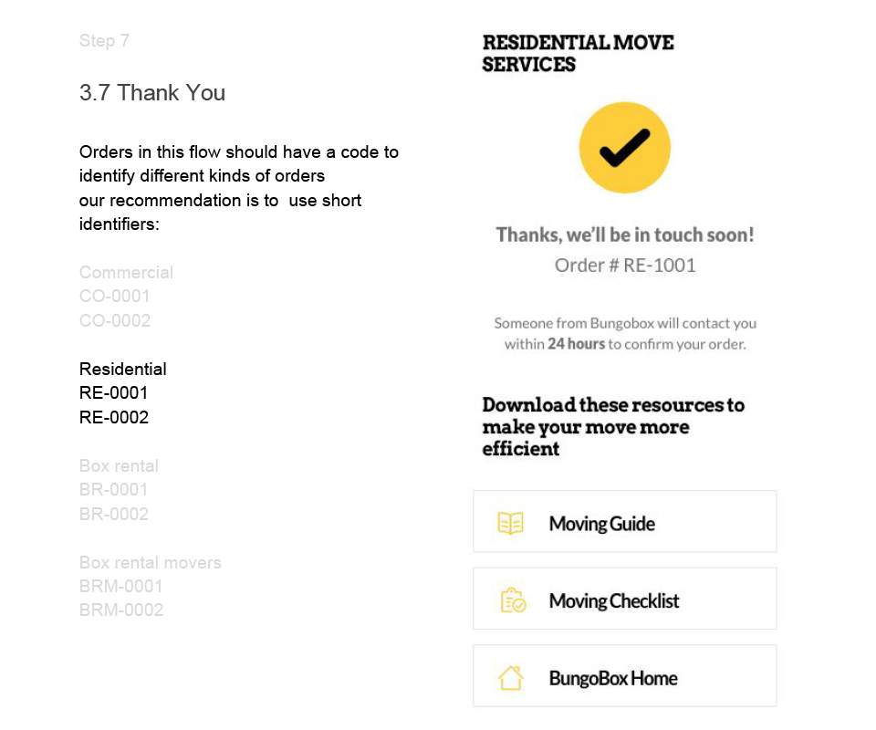
The design document included all flows to serve box rental, commercial, and residential moving. In this document, I presented fonts, colors, and copy for every step. This document, along with two live links to the prototypes, allowed me to keep the BungoBox team informed about every step in the process.
Mock Ups
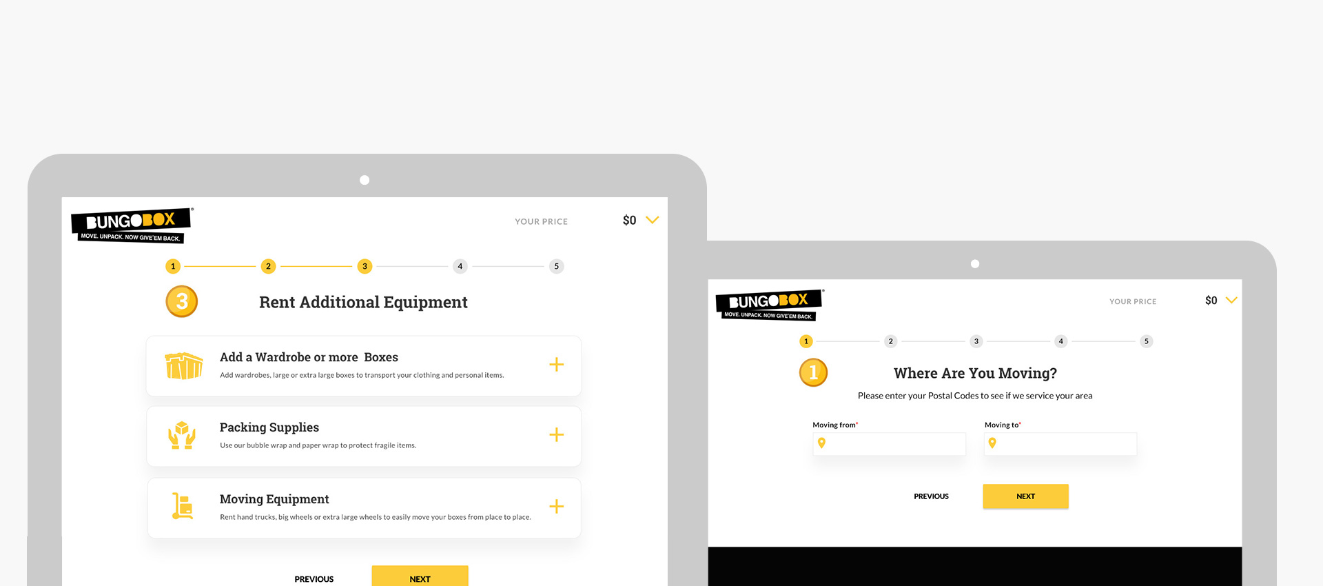
After having ready all flows, tweaking copy, and other components, I started creating final mockups in Photoshop for this booking system following the new brand guidelines. I used a material design approach and showed every state for every component in the experience. I created SVGs for every single icon so that these render at the best quality on high-density screens. Also, I edited every product image in this booking system.
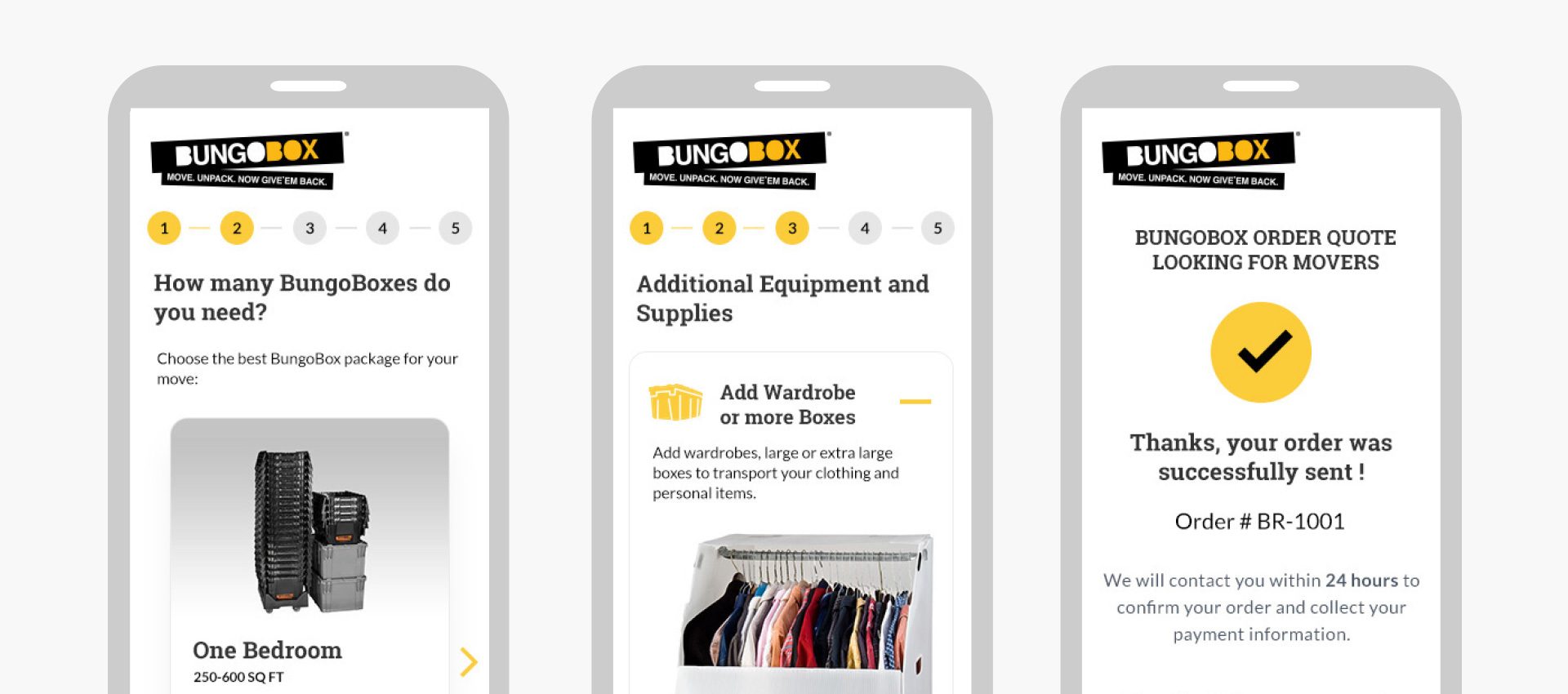
Mobile Version
As mentioned before, I based this design on a 320px screen to plan for the ‘smallest screen in the market’. I wanted to provide nicely sized buttons, which allowed users to complete their tasks on a phone in a comfortable way. I focused on providing a ‘clean’ experience with accents in the interface using colors on interactive items.